The distribution report provides more in-depth information on your respondents. Where are they located? What device are they using? Which website sent them to the survey? Did they read your email invitation? And much much more.
To open the distribution report click on Analyze and then on Distribution Report.
You can find the following charts and information here:
Response summary

The response summary gives a full overview of your survey. It provides data such as the survey start and end dates, the number of (partial) responses, how many contacts saw the email, how many clicked through, the number of respondents per distribution channel, etc.
Response timeline

The response timeline is a graphic overview of the number of respondents per day for the full period that the survey is live. Click and drag across the chart to see the details for that specific period only.
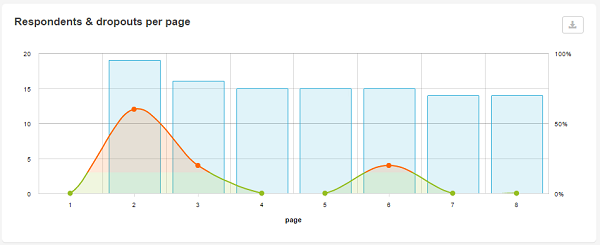
Respondents & dropouts per page

For each survey page you can see how many respondents were registered as well as how many respondents dropped out.
More info: Respondents and dropouts per page
Channels

If you’ve activated more than 1 distribution channel you can follow up the response per channel via this chart.
Mobile vs. Desktop

This chart shows the ratio of respondents that filled out the survey via a desktop and those who filled it out via a mobile device.
Both smartphones and tablets are counted as mobile devices. Laptops are included in the number of desktop users.
Browser

Which browsers do respondents use to fill out your survey? here, too, you can see how often the survey was filled out on a mobile browser.
Operating system

This report is similar to the browser report, only it shows the specific operating system of each respondent.
Referring sites

This chart lists the websites that sent respondents to your survey. Especially handy when you’ve posted the link on multiple websites and you wish to know which website has the most traffic.
Additionally you can add query string parameters to the survey URL to add this information to the reports as well.
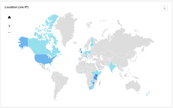
Location (via IP)

Where are your respondents located? Find out at a single glance using the location report. The darker blue a region on the map, the more respondents came from this area.
Zoom in on a specific area to see the ratio per city within a specific region.
Hover over an area to find out the exact number of respondents for that specific country or city.
Download
You can download the entire report as a PDF file. Or you can download each chart or overview separately.
To download the entire report click on Download in the top right corner.
To download a separate chart or overview as an image click on ![]() in the top right corner of that particular chart.
in the top right corner of that particular chart.
Share the distribution report
You can also share the entire distribution report with people who don’t have access to CheckMarket. They’ll be able to follow up on the results in real-time.
In order to do so click on the Share button in the top right corner and copy the URL provided. Simply send this URL to whomever you want to share the report with.
Leave a Reply