Webdesign is slowly moving away from the full page views we were so used to. More and more you see individual ‘cards’ on web pages. Twitter is a good example of this usage of cards. You can mimic that view using our survey tool as well.
Switch to a ‘card’ design
By making some small changes to the Appearance settings in your survey you can easily put each question in a separate card.
- Go to the survey.
- Click on Settings and then on Appearance.
- Click on Frame.
- Check the box next to Show frame.
- Choose a color for the background. This will be the background color of your survey.
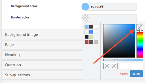
- Set the border color to Transparant. You can do so by deleting the hexadecimal code that’s mentioned, or by selecting the X in the color picker.
- Click on Page.
- Set the background color to Transparent. You can do so by deleting the hexadecimal code that’s mentioned, or by selecting the X in the color picker.

- Click on Question.
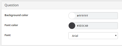
- Select a background color. This will be the color of your cards.
- Click on Save.
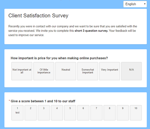
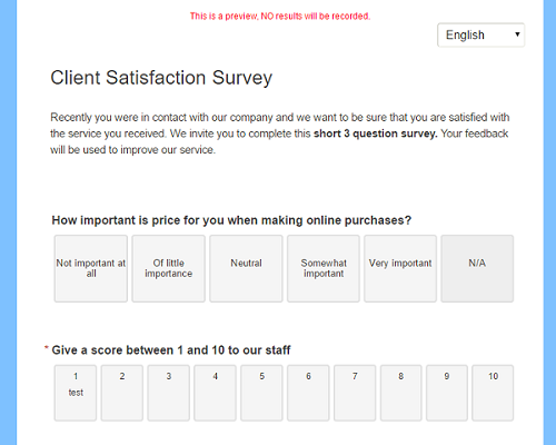
Now when you open the preview you will see the cards version of your survey.
Switch back to the full page view
Of course if you want to keep the traditional page view, this is still possible, too.
- Go to the survey.
- Click on Settings and then on Appearance.
- Click on Frame.
- Check the box next to Show frame.
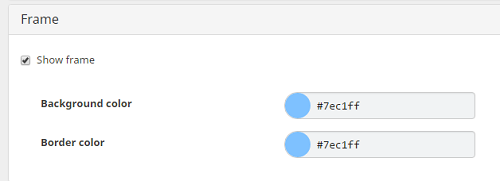
- Set a background color and border color.
- Click on Page.
- Select a background color.

- Click on Question.
- Select the same background color as you used for the Page.

- Click on Save.
Now when you open the preview you will see the page version of your survey.
Leave a Reply