Use the settings on the Appearance page to customize your survey. After you make changes, you can view them by clicking Preview in the top right corner of the page. You can also test your survey.
If you want a professional design for your survey that fully matches your company’s look ‘n feel, you can use our Custom design service.
Net Promoter and NPS are registered service marks, and Net Promoter Score and Net Promoter System are service marks, of Bain & Company, Inc., Satmetrix Systems, Inc. and Fred Reichheld.
To set up your survey’s appearance, it is important to know which settings affect which part of your survey. To view the Appearance settings, complete the following steps:
- Select Settings from the CheckMarket main menu.
- Select Appearance.
- Make a selection from the appearance options. The sections below describe each available option.
Themes
See this article to create themes and apply them to surveys.
Logo/Banner
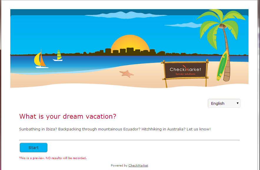
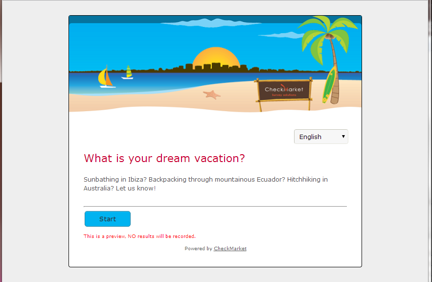
A banner is an image or colored bar that appears on top of each survey page. It is usually rectangular in shape and has the same width as your survey. When you do not use a frame (see below), your banner size will automatically adjust to the available screen size of the device on which the survey is being filled out.
- None — No banner will be shown.
- Media library — Select an image from your media library or upload a new image.
- URL — Enter a hyperlink to the banner’s location.
- Color — Instead of an image, you can also use a colored bar. Select the color of the bar.
- Alignment— If your banner is not the same width as your survey, select whether to align it to the left, center, or right.
- Link — Add a hyperlink to where respondents who click your banner will be redirected (e.g., your website).
Show/Hide screen elements
- Show question numbering — If you select this option, the question numbers will be shown as configured on the survey details page. If you are using branching or page display logic, CheckMarket recommends that you turn off your question numbering.
- Show ‘Back’ button — Respondents can go back to a previous page using this button.
- Show ‘Pause’ button — Respondents will receive a URL to which they will be able to go to the last page they were filling out. If respondents (accidentally) close their survey without clicking this button, they can still go back to the final page by clicking on the original link in their email invitation.
Background image
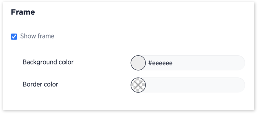
Instead of a frame, you can use an image to show around the survey questions.
- None — Select this if you do not want to show a background image.
- Media library — Select a file from your media library or upload a new image.
- URL — Enter a hyperlink to the background image’s location.
- Repeat — If you have selected an image and your image is smaller than the available screen size, you can choose to repeat it using the following settings:
- no-repeat —The image will be shown once in its actual size.
- repeat-x—Refers to the x-axis (i.e., the image will be repeated horizontally). This is useful if you have a small and long image.
- repeat-y — Refers to the y-axis (i.e., the image will be repeated vertically). This is useful if your image is wide.
- repeat:— The image will be continuously repeated, both horizontally and vertically.
- fit — The image will be scaled so that it appears across the entire available screen size of the device on which your survey is being filled out.
- left-bottom — The image will start from the bottom-left corner of the screen.
Page
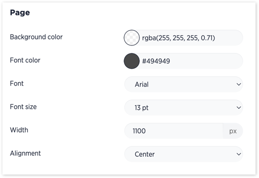
These settings are for the survey page, which is the area in which questions are shown.
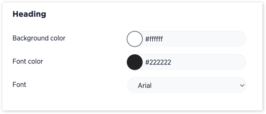
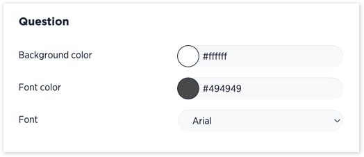
- Background color — The survey’s background color. Note: This is not the same as the frame color.
- Font color — Font color of the text on the survey page as well as the introduction, thank you page, etc.
- Font — Font type of the text on the survey page as well as the introduction, thank you page, etc.
- Font size — Size of the text on the survey page as well as the introduction, thank you page, etc.
- Width — Maximum width of the survey area. If a screen is smaller than the defined width, the survey page will automatically adjust. When the screen is wider, the survey page will be exactly this width. The rest of the screen will be taken up either by the frame color or background image.
- Alignment — Where the survey will appear on the page. This setting is important when you make use of a frame.
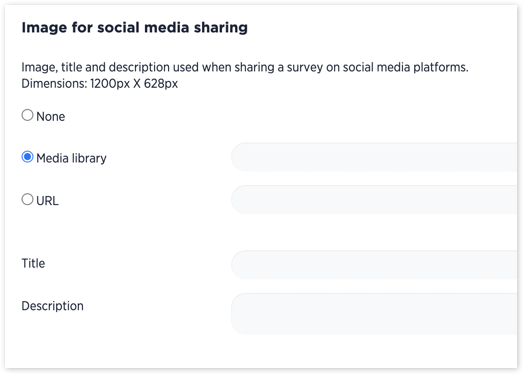
Image for social media sharing
Increase the response rate by adding a title, description and image when sharing your survey on social media or via a messaging platform like Whatsapp.
Find out more here.
- None — No image will be shown.
- Media library — elect an image from your media library or upload a new image.
- URL — Enter a hyperlink to the image’s location.
- Title — Title of the image.
- Description — Description of the image.
Custom CSS
Use your own CSS to customize the look of the survey. This is an advanced optional setting that can be left blank.
In the image below, an example CSS code is displayed that will hide the radio buttons and check boxes in front of response options.





4 comments
Join the conversationPaul Heinzelmann - March, 2021
i WAS USING A covid-19 TEMPLATE THAT TURNED THE PHONE SCREEN GREEN WHEN PEOPLE WERE CLEARED BNASED ON THEIR ANSWERS… NOW THAT’S DISAPPEARED (LIKELY AFTER i ADDED A tHEME). hOW CAN i GET THAT FUNCTION BACK?
Nadia De Vriendt - March, 2021
hi Paul, I’ve opened up a support ticket for you so that they can have a closer look at your survey and its appearance. It’s likely linked to the appearance settings. They’ll be able to put it back for you. You’ll hear from them soon.
Yvonne - June, 2019
How can you hide the asterix shown when an answer is required?
Nadia De Vriendt - June, 2019
hello Yvonne, thank you for reaching out to us. You can hide the asterisk using custom CSS. When you go to the Appearance Settings of your survey, add
.req {display:none}to the custom CSS box and save these settings.Do take into account that the asterisks are a generic method to indicate that certain fields (questions in this case) are required. When you hide those, it may be a source of frustration for your respondents, i.e. when they don’t see any indication that a question is mandatory and leave it blank, only to receive a notification that they missed a mandatory question.
Something to think about :-)