A Key Driver Analysis (KDA) examines the relationships between potential drivers and behavior such as the likelihood of a positive recommendation (NPS) or overall satisfaction.
What is it for?
It’s important to identify and understand the drivers of key business metrics, such as customer satisfaction or loyalty, in order to improve processes and profitability. If you are conducting NPS surveys, you will want to understand, which aspects of your service or product influence how likely a customer will be to recommend you to others. A key driver analysis is used to address exactly this sort of question.
By knowing which aspects of your service or product influence your overall satisfaction and loyalty the most, you will know where your organization should be putting its energy.

Outcome metric
The outcome metric is the term used for the main question in your survey. Usually it is the overall satisfaction or NPS (loyalty) question.
For instance: On a scale of 1 to 10, how satisfied were you overall with your stay at Hotel ACME?
Potential drivers
Potential Driver is the term used for performance rating questions in your survey which you think influence your primary question or outcome metric as it is known.
Continuing the example above, we may ask respondents to rate aspects of your hotel, such as cleanliness, food, swimming pool, staff, etc.
Warning: Statistical explanation ahead…
KDA works by using multiple linear regression to investigate the correlations between independent variables (potential drivers) to generate the best linear combination to predict a dependent variable (the outcome metric).
It provides a model using the absolute value of Pearson’s r, which calculates how well the independent variables (potential drivers) predict the dependent variable (the outcome metric) on a scale of 0 to 1. The strength of the relationship can be described by squaring the correlation and multiplying by 100. The resulting statistic is known as variance explained (or R²). For example, a Pearson’s r value of 0.50 means that 25% of the variance in the dependent variable is “explained” or predicted by the dependent variable.The higher the importance value, the more a potential driver affects the outcome metric. Keep in mind that a high correlation does not necessarily imply a causal relationship.
How to read a Key Driver Analysis chart
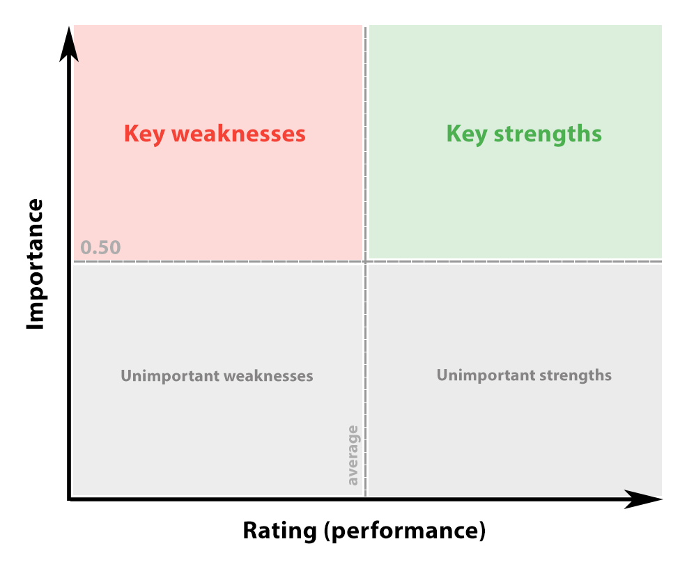
The chart plots the average rating of potential drivers on the X-axis vs the correlation or importance of the potential drivers on the outcome metric on the Y-axis.
The further to the right a question is, the higher the average score and more satisfied respondents were with that question.
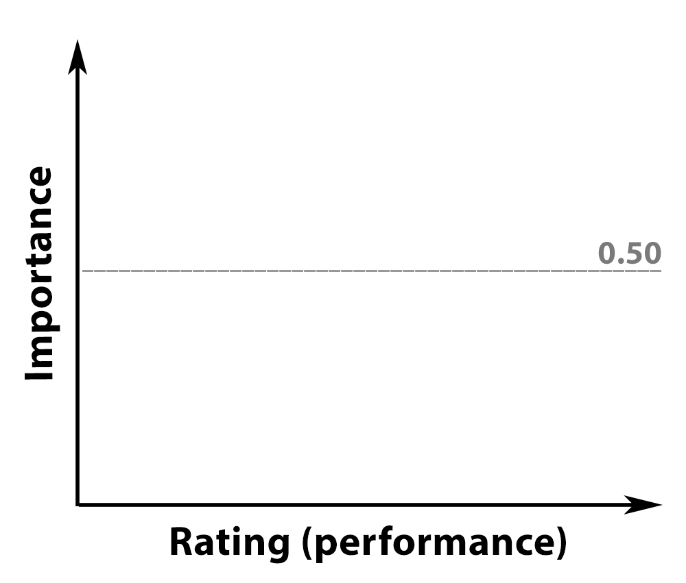
The higher up a question appears, the stronger the impact of that question on the outcome metric (main satisfaction or NPS question). Best practice is to only consider potential drivers as key drivers if the importance is more than 0.50.

Normalized scale
The ratings on the X-axis use a normalized scale. This means the value ranges from 0% to 100%. This axis is normalized because it is dependent on the average score. Normalizing makes it possible to compare potential drivers with different scales. This percentage is calculated by taking the average value for the potential driver and dividing it by the maximum scale value for that question.
For example, if a question has a scale of 1 to 10 and the average is 5.5 then the rating percentage is 55%. Now if another question has a scale of 1 to 5 and the average is 3, then its rating percentage would be 3/5 or 60%. Converting them to a percentage makes it possible to plot them on the same graph and compare them.
Key Driver Quadrants
The two light gray dashed lines split the chart into 4 regions or quadrants.
The horizontal gray dashed line at 0.5 on the importance scale on the Y-axis, is the threshold usually accepted at which point a driver becomes a reliable and accurate predictor of the outcome metric.
The vertical gray dashed line on the performance scale on the X-axis, is the threshold of when average scores change from performing well to performing poorly. The default is usual the average score of all the potential drivers.
The key driver chart has four quadrants:

- Key Weaknesses: Important but poorly rated. These values fall in the top left quadrant and indicate drivers that play a large role in determining the outcome metric. However, these drivers have lower average scores. This is an area of improvement. Drivers that fall in this quadrant warrant effort by your organization to improve. Getting these scores up, will also raise your overall satisfaction or loyalty scores.
- Key Strengths: Important and highly rated. These values fall in the top right quadrant and indicate drivers that play a large role in determining the outcome metric. These drivers also have higher average scores meaning that they are already performing well.
- Unimportant Weaknesses: Not important and poorly rated. These values fall in the bottom left quadrant and indicate drivers that are not important in determining the outcome metric. These drivers also have low average scores.
- Unimportant Strengths: Not important but highly rated. These values fall in the bottom right quadrant and indicate drivers that are not important in determining the outcome metric. These drivers also have a high average score. While one might argue that high scores are always a good thing, they do not influence the outcome metric.
Where should I start?
Drivers found in the top left quadrant are a good place to start. These drivers have a significant effect on your outcome metric (usually overall satisfaction or NPS), but aren’t performing well according to your respondents.
Add Key Driver Analysis to a report
Follow these steps to add a KDA to a survey report:
- Go to the survey.
- Click on Analyze.
- Click on Reports.
- Edit an existing report or create a new report.
- In the report, select the element after which you would like the new element to appear. Otherwise it will be added to the end of the report.
- Click on Add element.
- Select the Element type tab.
- Select Key driver quadrant.
- Select your outcome metric (usually an overall satisfaction or NPS question).
- Select one or more potential drivers (you can add more later).
The element will appear. You can further modify it by clicking on the Settings tab in the Properties pane.
Minimum number of respondents
In order for multiple linear regression to work, there must be at least 50 + (8 * number of potential drivers) respondents (Tabachnick & Fidell, Using Multivariate Statistics). For example, if you have 4 drivers, then there must be at least 50 + (8*4) = 82 respondents minimum. If there are not enough respondents then no chart will be rendered. Once that threshold has been reached, the chart will be rendered. That is the minimum to even get a result. The statistical significance will grow with more respondents. For example, If you want to detect a 0.10 correlation with 80% power, you’ll need about 650 respondents.
Leave a Reply