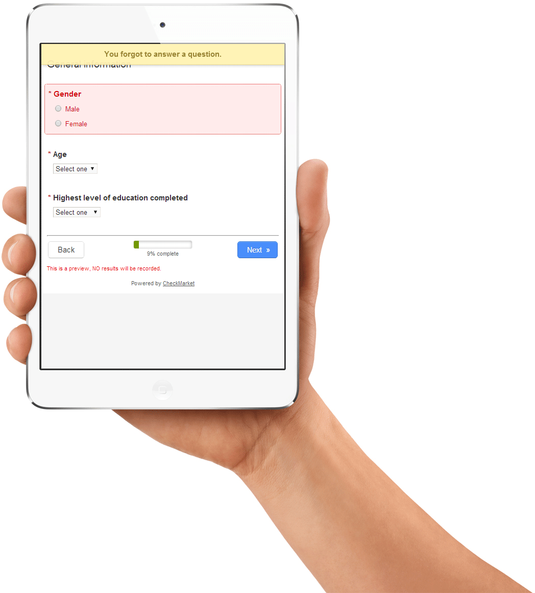
The response rate of a survey is important, but as researchers, we often use only fully completed surveys. That means we need to get people to take the time to reach the end of a survey. While there is lot of talk about gamification and other high-end solutions, as is often the case, the devil is in the detail. We have always worked hard to keep page-load times down in our survey tool. If a respondent feels a survey takes too long to load between pages, they are gone. We have also worked hard to make our surveys mobile friendly.
We recently reviewed the way we give respondents messages while they are filling-in a survey. When a respondent does not complete a required question and clicks next, we used to show a pop-up with a long message like:
“You forgot to complete the following question:
‘The question text’.
Please answer this question before continuing.”
The respondent had to then click on “OK”. If the question was long, this pop-up was large. What’s more, since the popup was created by the browser, it looked different in every browser. Sometimes it included extra information from the browser like ‘This page says:’
We now show a semi-transparent yellow bar across the top of the page. We also reviewed all the messages that we show respondents, shortening them, shaving off extra words here and there, making them as succinct as possible. The messages do not require a click to dismiss anymore either. In the example above, of a respondent forgetting a question and clicking “Next”, the yellow bar descends and states “You forgot a question”. Meanwhile the page automatically scrolls, placing the forgotten question at the top and giving it a light red background. When the respondents starts to answer the question, the background is removed and the message bar fades away. The feedback feels natural, clear and smooth.
The new message bar works consistently across all browsers including mobile, offers clear feedback and gets out of the way when it needs to.


Leave a Reply