According to a study from Greenbook[1] with over 1.5 million participants a whopping 19% of all online surveys are taken on a mobile device. CheckMarket’s data confirms 1 out of 5 respondents needs a mobile-friendly surveys.
Smartphone and tablets are used more and more
Tablet usage is growing faster than a Sunday-morning-gossip in the church parking lot. Last year tablet users almost tripled in Belgium according to Deloitte’s international survey (Global Mobile Consumer Service)[2]. Belgium together with France, Germany and USA leads in market penetration of tablets. In addition, older age groups adopt the tablet in impressive triple digits. The age group older than 55 bought 300% more tablets in the last twelve months.
‘All of the above’ adds another dimension to creating surveys. Below you will find some guidelines to create mobile-friendly surveys.
Assume every survey is filled in on mobile
You can’t choose on what device (desktop or mobile) respondents fill in your survey. No, really, you can’t choose. It means you must assume every survey is filled in on mobile, and that has consequences.
Go for responsive design
But what exactly is responsive design? It’s a web design approach aimed to provide an optimal viewing experience across a wide range of devices. Responsive design automatically adjusts the view to the screen size of a device.
Next you’ll need a powerful, yet simple survey tool with responsive design to create your surveys. Without this feature 20% of your online audience will abandon the survey. You have to ensure your survey works and looks great on mobile devices. It directly lowers your dropout rates, which provides you with richer data results.
Make your survey fun
Respondent completion rates stand or fall with a survey structure. A lean survey structure results in a much more enjoyable experience.
Keep it simple and short
KISS is your motto with mobile surveys – keep that in mind for your non-mobile surveys too. Aim to keep your survey under 10 minutes. The shorter your survey, the lower your dropout rates. Also use simple question types, thus avoid MaxDiff questions or wide matrixes.
Lose nice-to-know questions. Determine with your team what you need to know beforehand. Evaluate the necessity of every question with the following question: “Is it absolutely crucial for our research to know the answer to this question?” No – Drop the question.
Use short sentences and questions. Short questions are less daunting to respondents, which lowers dropout rates. “What is your gender?” can easily be shortened to “Gender”. This is a tough guideline to follow because you need to balance between the clarity and the shortness of your questions.
Avoid white space between questions. Opt for multiple pages if you feel the need to add white space between questions.
Limit text boxes. Open-ended questions are not only a challenging task to draw results from but also lengthen your surveys.
Minimize scrolling
Avoid wide matrix question types, as these are more difficult to complete on a small screen (even with responsive design). Minimize scrolling, especially horizontal scrolling leads to irritations and dropouts.
Avoid repetition
Did you invite your respondents via email? No need to repeat the introduction again at the start of the survey. Let respondents instantly start filling in the questionnaire.
Messages like “Thank you for your time.”, “Your opinion counts” or “Thank you for agreeing to participate in our survey” are noise to a mobile user. This message should already be mentioned in your survey invitation, thus to be avoided in the actual questionnaire. These messages often result in vertical scrolling, which we are avoiding. How lower the extra effort for your respondent, how higher the completion rate of your survey.
Use mobile-friendly images and videos
Images and videos are often used in surveys to provide extra context. We obviously don’t want to lose that extra context for our mobile respondents. Therefore, avoid flash completely. Flash is by default not supported by mobile devices. For videos it’s important to offer a wide range of video quality. Your video has to be playable on any device; from the first age of smartphones to the newest tablets on the market.
Wear a respondent’s shoes
Ask your friends or colleagues to test your survey with all kinds of mobile devices: Android smartphone, Android Tablet, iPhones, iPads, Windows phones, Tablets, etc.
Tip: Google Chrome’s free extension ‘Window Resizer’ is my partner in crime. Use it to test your survey design on your desktop or laptop. You can resize your window as if you were on a mobile device. You won’t have to bother your friends or colleagues.
Test, test and test it again. I can’t stress this enough. Test your survey a few times yourself for the first time. Adjust the survey appropriately. Review your survey again a few hours later. I can guarantee you will find flaws you didn’t the first time. Lastly, let a trial sample test your survey. Preferably a sample which best represents your actual target audience.
Style your mobile-friendly surveys
A custom design augments your survey’s response rate. Respondents are more likely to complete an attractive survey. Mobile users are no different – however there are different design aspects.
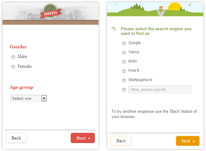
Most smartphones will only display your banner and the actual survey. Make sure to integrate your key visuals into this banner. Also keep your banner text readable if it contains an important message like your brand, baseline or product name. Look at the survey example below that CheckMarket uses as a template for ‘Website Visitor Survey’. The baseline is easily readable and the banner creates a complete look and feel of the brand.

Conclusion
Optimize every survey for mobile devices. You just don’t know on which platform your respondents fill in your survey. And you don’t want to ignore 19% of all your respondents.
Not convinced of the importance of mobile surveys? I’ll leave you with one last statistic: 48% of those aged 23-30 would give up their own sense of smell if it meant they could keep an item of technology (most often their phone or laptop).[3]


Leave a Reply