Responsive design is being talked about, and it’s no surprise. People are going mobile more and more, which is why you need to consider mobile surveys.
For that reason we’ve already made sure that our surveys are mobile device friendly. They can be filled out with the same ease on any device.
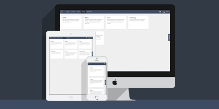
And now the CheckMarket platform itself is mobile friendly as well. This gives you more freedom in the time and place you want to create your mobile friendly survey, add images to the media library, review your results, etc.
Through the use of cards we’ve made it possible to use our tool no matter which device you are using, be it a desktop, laptop, tablet or smartphone.

Leave a Reply